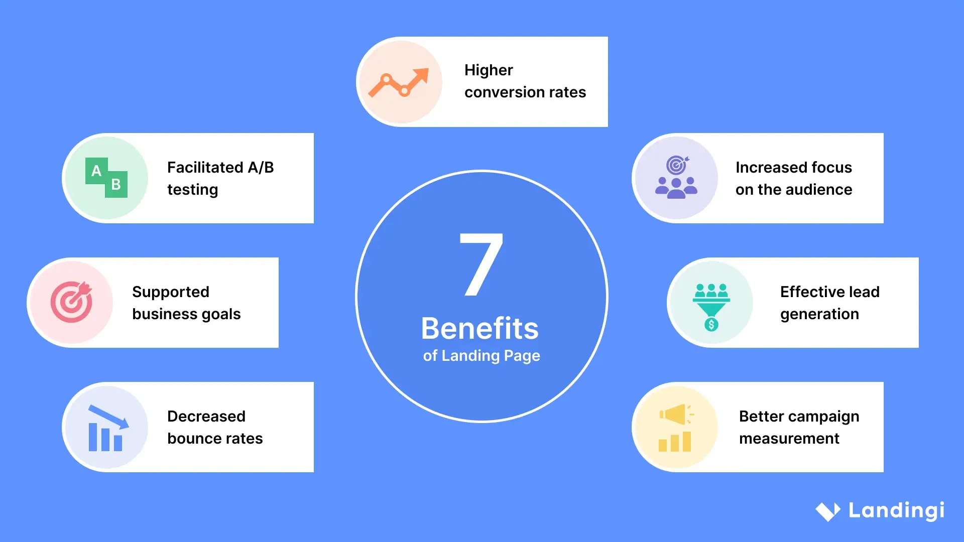
A landing page is not just another page on your website — it’s a focused, conversion-driven space where distractions are removed, clarity is king, and every element serves a single purpose: turning visitors into leads or customers.
But not all landing pages are created equal.
At Elevate Marketing, we build landing pages that don’t just look good — they perform. If you’re launching a campaign, offering a lead magnet, or promoting a new service, here’s what separates high-converting landing pages from the forgettable ones.
1. One Goal, One Page
The most effective landing pages do one thing really well. Whether it’s collecting emails, booking appointments, or selling a product — there should be no question what the page is about.
🛑 No menus.
🛑 No external links.
🛑 No multiple CTAs.
✅ Just one clear path to action.
Ask yourself:
“What’s the ONE action I want the user to take on this page?”
2. Compelling Headline That Grabs Attention
Your headline is the first thing visitors see — and it determines whether they keep scrolling or bounce.
Great headlines are:
- Benefit-focused (“Double Your Sales in 30 Days Without Ads”)
- Clear and specific (“Free Guide: 5 Steps to a Healthier Back”)
- Emotional and urgent (“Stop Wasting Money on Dead Leads”)
Pair it with a subheadline that explains the how, why, or who it’s for.
3. Strong Visual Hierarchy & Design
Visitors scan — they don’t read everything. That’s why the layout of your landing page matters just as much as the content.
Design tips for conversions:
- Use short paragraphs and bold headings.
- Add relevant visuals (product images, mockups, or explainer videos).
- Use contrasting colors for CTA buttons.
- Keep plenty of white space to reduce cognitive overload.
You want the eye to flow smoothly to the CTA — not bounce around in confusion.
4. Persuasive Copy That Connects
The copy on your landing page should speak directly to the visitor’s pain points, desires, and objections. This is not the place for fluff or jargon.
Use this simple copy structure:
- Problem – What your audience is struggling with.
- Solution – How your product/service helps.
- Proof – Why they should trust you.
- Action – What they should do next.
Make it feel like you’re reading their mind — and offering the exact answer they need.
5. Irresistible Offer (with Low Friction)
A landing page without a strong offer is like fishing without bait. Make sure your offer is something they want — and something they can say “yes” to easily.
Examples of great offers:
- Free trial or demo
- Discount or limited-time deal
- Free resource (eBook, checklist, guide)
- Webinar or video training
Remove any resistance by making the process quick and easy (e.g., “Enter your email to get instant access”).
6. Social Proof That Builds Trust
People need to know that what you’re offering has worked for others. Adding social proof reassures hesitant visitors and validates your credibility.
What you can use:
- Testimonials with names and photos
- Logos of companies you’ve worked with
- Case study highlights or stats
- Star ratings and reviews
Place this proof right before or after your CTA to reinforce confidence in clicking.
7. Clear, Bold Call-to-Action
Your CTA (Call-to-Action) is the make-or-break moment of the landing page. It needs to stand out, be clear, and create urgency.
Examples:
- “Get Your Free Quote Now”
- “Download the Checklist”
- “Reserve Your Spot”
- “Start My Free Trial”
Make sure the button contrasts visually and appears at least twice on the page (top and bottom).
8. Mobile Optimization
More than 60% of landing page traffic comes from mobile. If your landing page looks cluttered, broken, or loads slowly on a phone — your conversions will suffer.
Optimize by:
- Stacking content vertically
- Using large, clickable buttons
- Avoiding pop-ups that cover the screen
- Ensuring images load fast
Test your page on both mobile and desktop before going live.
9. Trust Elements & Legal Info
Especially if you’re collecting data (emails, payments, personal info), users want to know their information is safe.
Add:
- Privacy policy link
- SSL security badge
- Money-back guarantees (if applicable)
- “No spam” or “You can unsubscribe anytime” note
A little reassurance goes a long way.
Final Thoughts: Every Element Should Earn Its Place
High-converting landing pages don’t happen by accident. They’re engineered with intention — every word, image, and button working toward one goal.
At Elevate Marketing, we’ve crafted dozens of landing pages that consistently outperform industry benchmarks. Whether you’re running ads, launching a new product, or just want more leads — we’ll help you build landing pages that convert browsers into buyers.
Want us to audit or design your next landing page? Let’s talk.

